


iOS/iPadOS/macOS 27 Design Kits: What App Teams Must Change for AI-Driven Interfaces
Hitesh Sondhi · September 14, 2026 · 6 min read
Your designer just dropped the new Figma file into Slack. It's the Apple design kit for iOS 27, and it looks clean. But the component tree tells a different story than last year's kit. Half the screen patterns assume a human is tapping buttons in sequence. Your app doesn't work that way anymore.
Apple shipped design kits for Figma and Sketch covering iOS, iPadOS, and macOS 27 on June 23, 2026, including updates to Liquid Glass and expanded component coverage across platforms. (Apple Developer News)
If you're building AI-driven interfaces, voice agents, or any UI where the system generates content and actions dynamically, the kit isn't just a styling refresh. It's a signal about what Apple expects your app's interaction model to look like.
What Actually Changed in the Kit
Liquid Glass is the headline update. It's Apple's material language for translucent, depth-aware surfaces that adapt to content behind them. Kits now include component variants that account for content overlays, contextual toolbars that appear based on user intent, and adaptive navigation patterns.
More interesting changes are structural. Component organization in the Figma file separates "determinate" components (fixed-state controls like toggles and steppers) from "generative" components (content surfaces that populate from model output). That separation matters because it maps to how you'll wire the UI to your model's API responses.
A button that triggers a deterministic action has a different contract than a surface that renders streaming text from an LLM. This is reflected in the kit, even if the documentation doesn't spell it out.
Where the Kit Falls Short for AI Apps
Here's the problem we keep running into. These design kits were built for apps where a human drives every interaction. You tap, the app responds, you tap again. Component states are designed around that assumption.
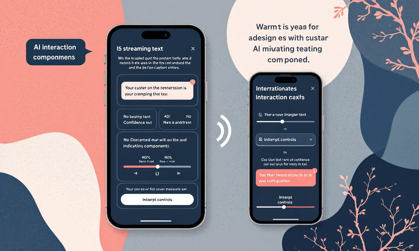
When you're building a voice agent or an AI assistant, the interaction model inverts. Now the system speaks, proposes actions, asks for confirmation. UI needs to render streaming partial responses, show confidence indicators, handle multi-turn disambiguation, and let users interrupt mid-generation. None of those states exist as named components in the kit.
We've been building RunHotel, our on-device voice AI for hotels, and the design kit gap became obvious within the first sprint. This kit has a beautiful sheet component for modal interactions. It doesn't have a "the model is currently transcribing audio and showing interim text" state.
Developers end up creating custom variants anyway, which defeats the purpose of adopting the kit for consistency.
API Contract Thinking for Design Kits
How we frame this for engineering teams: treat the design kit like an API contract for your UI layer. Each component is a schema. It has input props (content, state, interaction callbacks) and output events (taps, gestures, value changes).
When the design kit doesn't have a component for your AI interaction pattern, you're not just missing a visual asset. What's missing is a contract. That means you need to define one, and you need to make sure your designer and your API layer agree on what that contract looks like.
For streaming responses, define the component's prop shape explicitly: contentChunks: Array<string>, isStreaming: boolean, interruptible: boolean. For agent action proposals, define proposedAction: Action, confidence: number, requiresConfirmation: boolean. Design kits won't give you these schemas, but your component library should.
Migration Is Not a Drop-In Update
If you're moving from an iOS 16-era UI kit, the jump to 27 is not incremental. Liquid Glass changes how you handle background blur, material compositing, and foreground contrast. Components that used solid backgrounds now expect translucency, which means your content readability depends on what sits underneath.
For teams building cross-platform apps (React Native, Flutter, or shared web/mobile codebases), the gap widens. These design kits are Apple-native Figma and Sketch. Translating Liquid Glass semantics to Material Design or web CSS is a judgment call, not a conversion script. Teams need to decide where fidelity to the native platform matters and where a shared abstraction is good enough.
We generally recommend keeping voice and agent UIs native on Apple platforms if you're targeting low-latency interaction. Platform audio session APIs, transcription pipeline, and rendering layer all matter when you're trying to hit responsive thresholds under 200ms. (Apple Developer News)
What to Audit Before You Adopt
Before your team adopts the iOS 27 kit, run through these checks.
Map every screen in your current app to a component in the new kit. Any screen that involves AI-generated content, streaming responses, or agent-driven actions won't have a direct match. Flag those now.
With your AI agents and voice AI surfaces, define the component contracts the kit doesn't cover. Document the prop shapes, state machines, and event handlers. This is where the real work is.
If you're running on-device AI with models like Qwen3 or Phi-3, test your inference latency against the UI states the kit assumes. A component that expects instant content population will look broken if your model takes 300ms to produce the first token. (Apple Developer News)
Teams building custom models or working through architecture decisions can get help from our AI consulting practice to map the design system to your inference pipeline. Also use our AI cost estimator to budget the inference overhead before you commit to the UI patterns.
Cross-Platform Projects Need a Forking Strategy
What we see in most cross-platform projects: you'll end up forking the design system. Apple-native components for the Apple build, Material-flavored components for Android, and a web variant that picks the closest approximation.
iOS 27 makes this harder, not easier. Liquid Glass is deeply tied to the platform's rendering engine. You can fake translucency with CSS backdrop-filter or Flutter's BackdropFilter, but the compositing behavior won't match. When your design system promises visual parity across platforms, it's lying to you.
An honest approach is to design a shared interaction model (states, transitions, content contracts) and let each platform's visual layer express it differently. That's more work up front in design and API planning, but it's the only thing that scales when the native platform updates its material language every year. To get help structuring that layer, contact us.